| Learn More About These Charts... |
|
In a Scientific American article about transcranial stimulation, author R. Douglas Fields notes that one of the most difficult tasks facing the Air Force is the intense training involved in teaching drone pilots to be able to look at a complex radar image, and pick out targets.
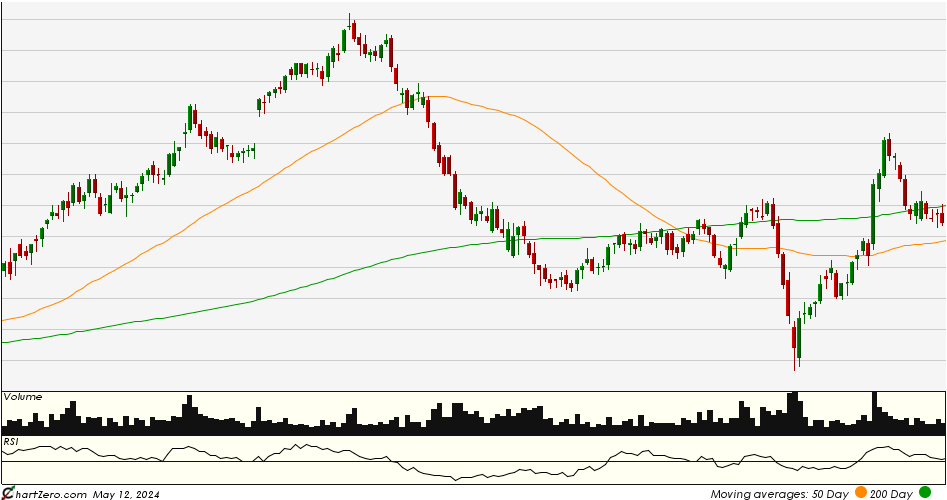
No computer can parse through these patterns and make an up/down judgment as to what is a target, but the human brain can be trained to be able to study a radar image and reliably pick out the patterns that point to something being a target. So the only answer for the Air Force is to train human pilots through countless hours of video simulators, during which the trainees are shown real image data from the past, and then asked to make a prediction. The trainee sometimes identifies a target correctly, and sometimes not, learning the answer from the simulator after they have made their prediction. By repetitively going through this exercise over and over again, their brains slowly begin to learn the patterns. According to the article, the biggest bottleneck for the Air Force in deploying new drones is the shortage of trained pilots, given that the number of training sessions necessary before the brain is able to reliably pick out targets, is extremely high. This got us to thinking about patterns in the stock market, as expressed in charts. Patterns like the 50-day moving average crossing the 200-day moving average and then diverging; patterns like increasing levels of volume during a strong stock move; patterns like the slope of the Relative Strength Index (RSI) at the same time other patterns appear. And countless others, potentially too complex for a computer to ever be able to absorb the way a human brain can. And we wondered: presented with training sessions consisting of historical charts, and asked to make an up/down prediction for where a stock went next, can the human brain be trained to zero in on the patterns that point to a stock about to climb (or fall) and make predictions more reliable than a coin toss? In line with this notion, on this page we present users with a random chart from within the S&P 500 components at a random point in time in history, without axis labels and without displaying any data or labeling that would reveal which stock is being shown. Users are then asked to predict: two weeks later, was the stock higher or lower? |
Was the stock higher or lower two weeks later?


LOWER |
HIGHER |
LOWER |
HIGHER |
| Invest Help Video Glossary |
|
|
